Locating the Dashboard
The Dashboard can be accessed by selecting 'Dashboard' in the left navigation panel. This page is also the default page after logging into Narware.
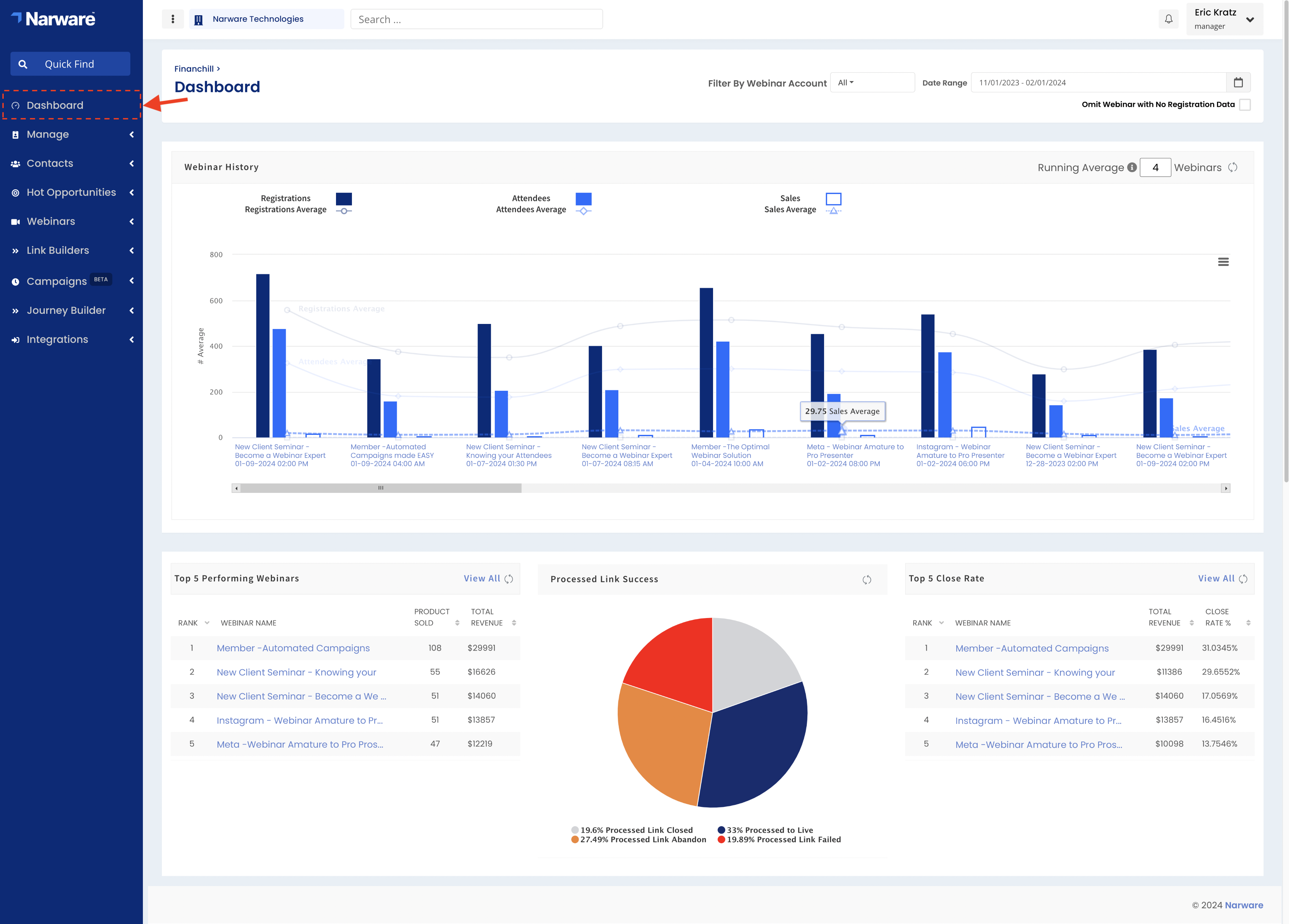
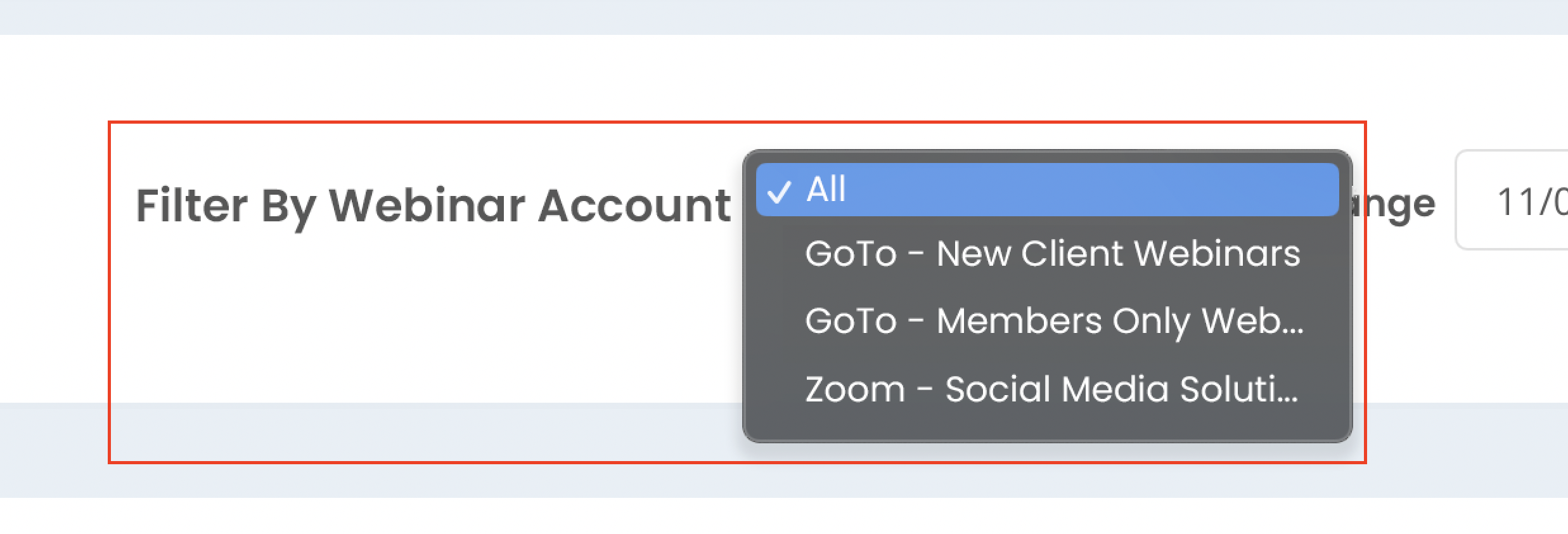
Filter the Dashboard by Account
If you have multiple Webinar Accounts connected to Narware you can select each account individually by selecting Filter By Webinar Accounts or select "All" to compare all webinars no matter the Webinar Account.
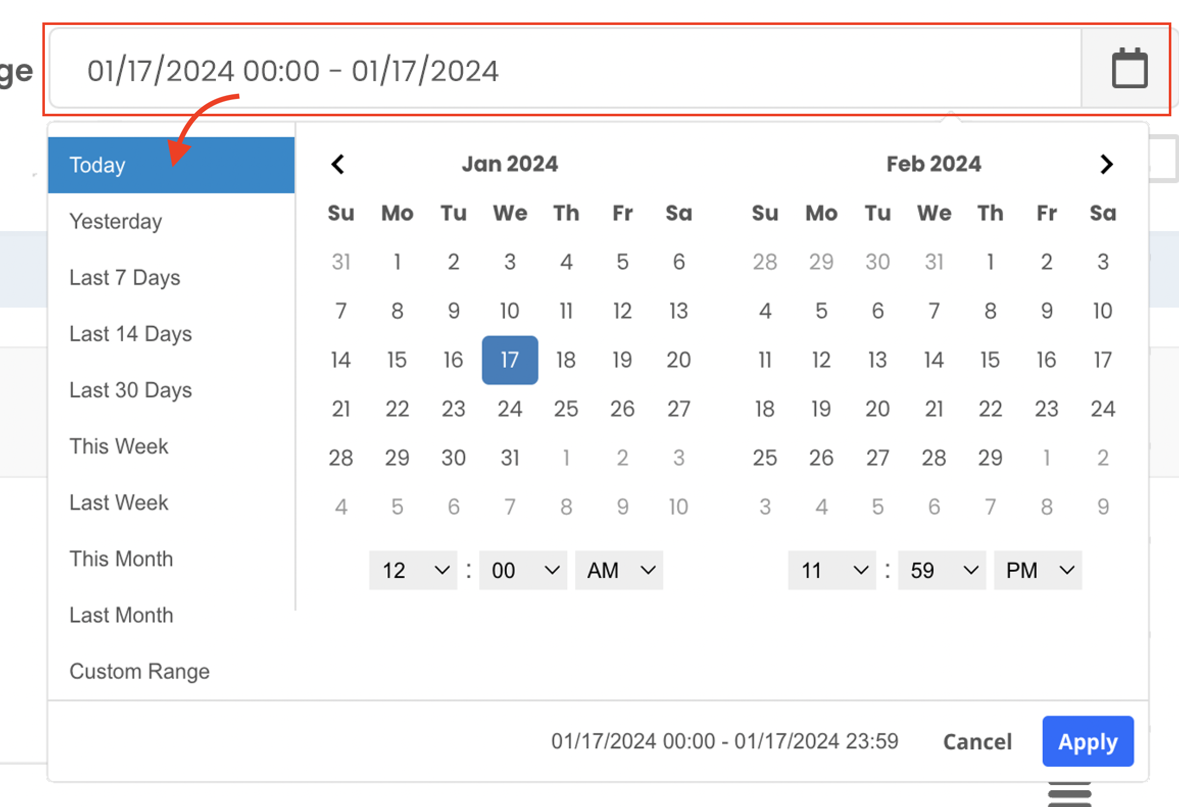
Defining the Date Range of the Dashboard
Select Date Range field and pick from the relative date ranges in the left of the Calendar picker or select a start and end date and select 'Apply'
After selecting the date range all the Webinars related to that range will load on the Timeline below with the Most Recent being listed to the left and oldest listed to the right.
How to read the Webinar History timeline.
The Webinar History section at the top of the Dashboard is a Timeline of Webinars listed as most recent displaying to the left and oldest displaying to the right.
In this timeline bar graph you will be able to see plotted Lines and Bars.
The Lines represent Webinar Averages defined by the Running Average. The number defined in the Running Average [#] Webinars in the top right of the Webinar History section defines how many previous webinars are included to define the average for the related webinar.
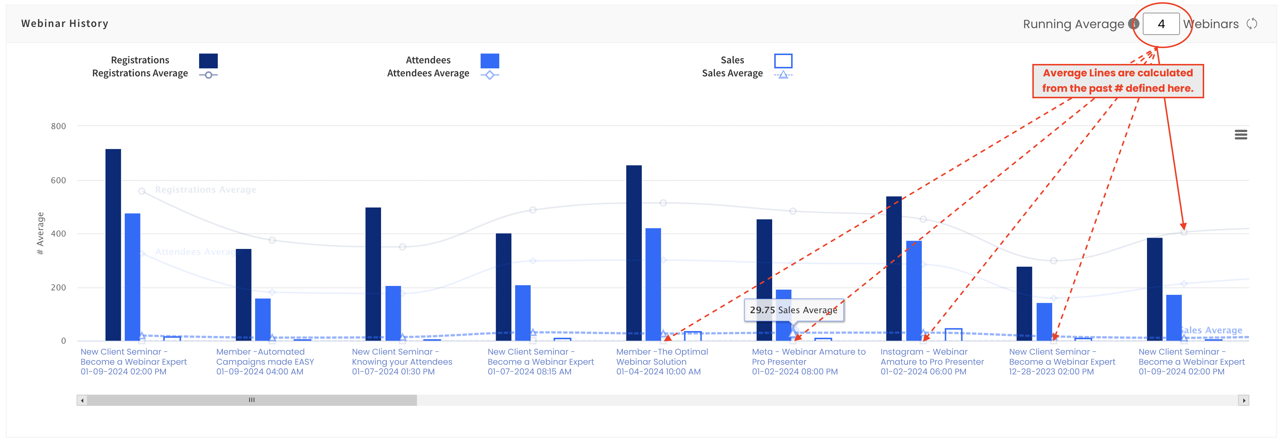
The Bars represent actual webinar reported data.
The reported data that is charted on the timeline graph for each webinar include:
• Number of Registrations of the Webinar
• Number of Attendees of the Webinar
• Number of Sales of the Webinar
Viewing the Top 5 Performing Webinars table
• Rank : This column shows the rank from 1 to 5 for the related webinars to the defined Date Range
• Webinar Name : This column shows the name of the webinar and links to the webinar record if selected.
• Products Sold : This column is sortable and shows the total number of products sold in relation to the Webinar.
• Total Revenue : This column is sortable and shows the total dollar amount of the products sold in relation to the Webinar.
You are able to view a complete list of All Webinars by selecting View All located in the top right of the Top 5 Performing Webinars table.
Viewing the Processed Smart Links Success pie chart
The Processed Smart Links Success pie chart identifies what was the general outcome when a Smart Link was processed.
• Processed Smart Link Closed identifies a Smart Link that sent a customer to a intended URL since a Webinar was not available to join.
• Processed Smart Link Abandoned identifies all Smart Links that where selected but abandoned by the contact before the link properly directed them to the designed path.
• Processed Smart Link to Live identifies all Smart Links that where selected and got a contact directly into a Webinar resulting in an Attendance.
• Processed Smart Link Failed identifies all Smart Links that where not processed successfully due to error in the Smart Link provided the contact.
Viewing the Top 5 Close Rate table
The Top 5 Close Rate table displays the top 5 webinars with the highest percent of Product sold based on the number of Attendees.
The table columns includes:
• Rank : This column shows the rank from 1 to 5 for the related webinars to the defined Date Range
• Webinar Name : This column shows the name of the webinar and links to the webinar record if selected.
• Total Revenue : This column is sortable and shows the total dollar amount of all the products sold in relation to the webinar.
• Close Rate % : This column is sortable and shows the percent of products sold vs the total number of attendees for the webinar.
| << Previous | app.narware.com | Next >> |